True “Togetherness” Through More Inclusive Design
“We’re all in this together” seems to be the widely adopted tagline of this pandemic, but I personally cringe when I hear it (especially when it’s an overly saccharine female voice pre-recorded on loop over the grocery store sound system). In these strange times, individuals’ experiences vary wildly and more often than not thwart this blanket-statement of solidarity. For many people outside the “mainstream” (i.e. racial minorities, those who are physically or mentally challenged, those of lower economic status who have lessened access to basic resources, etc.), life during COVID-19 has been an enormously difficult, exclusionary experience.
A recent design project got me thinking on a deeper level about the obstacles faced by others during this pandemic and how now, more than ever, inclusivity and representation are important in our communications. My task was simple: design a ground stencil to encourage social distancing in a public area. A quick online search for “social distancing sign” reveals the same archetypical graphics: full-bodied figures standing apart, or often just a simple set of feet/shoes marking where to stand. Seeing these same types of designs over and over validated my thought that these were the most recognizable graphics for a clear, effective social distancing sign. So I did what many other designers have done, and used an icon of a pair of shoes to show pedestrians where to stand six feet apart from one another in the space. Problem solved, or so I thought.
Then came the client’s feedback. Their mission was to be as inclusive and accommodating as possible in all their COVID-19 communication touchpoints, and they felt the iconography of shoes didn’t meet this standard. What about people with physical disabilities who rely on aids such as wheelchairs or scooters to get around? They cannot “stand” as represented in my design choice. While my intentions were to be clear and concise in my visual representation of social distancing, I inadvertently didn’t consider inclusivity and representation in my design.
I’m genuinely always receptive to client feedback (I may not always agree with it, but I keep an open mind), and this case in particular was an eye opener for me. It made me consider things from a different perspective and add a layer of conscious decision making to my design process. I went back to the drawing board and resolved my design by using less specifically targeted graphics (a non-descript human figure shown from the shoulders up with arrows representing six feet of distance), and this solution was deemed successful by the client.
Being more inclusive through design isn’t necessarily a hard choice to make, but it might not always seem like the “obvious” solution to those like myself who don’t face the same daily challenges as others who are so often excluded or ignored by society. Let’s be clear here: I am a white, middle-class, able-bodied female, employed and living comfortably in a metro area. I am beyond privileged and would be doing a great disservice to all by not acknowledging it. I cannot equate my experiences to those of others or write about any topic here without it being through my lens of privilege and personal biases. But what I can do is avoid making excuses of ignorance and begin taking more responsibility for my choices as a designer (and human being in general) as they can impact the wellbeing of others, particularly those who are not as privileged as myself. At Graffito, our mission to create better cities is largely based in activating spaces that are inclusive, equitable and fairly representative of the people that make up our diverse neighborhood fabrics, and I want to strive to be more mindful of this in my design process going forward.
I’m glad to know there are others out there who are also working to be more inclusive and helping those with disabilities to navigate new social norms more easily. For instance, the practice of wearing face coverings makes it very difficult for those who are deaf or hearing impaired to practice lipreading. These people often rely on reading facial expressions and lip movements to help communicate, and masks that obscure half a person’s face pose a huge challenge. To help resolve this issue, innovative individuals around the world have designed face coverings with partially or fully transparent components that allow the wearer’s mouth to remain visible while still offering protection. There’s now commercially produced models available, and also easily accessible instructions for DIY versions like this one: https://www.hsdc.org/accessible-deaf-friendly-face-mask/
This is just one great example of design ingenuity that promotes equity and inclusivity for the ways in which we communicate. I’m also glad to see that effective as of May 12, the City of Somerville’s twice-weekly COVID-19 update emails sent to residents now end with the following statement: “Individuals with disabilities who need auxiliary aids and services for effective communication, written materials in alternative formats, or reasonable modifications in policies and procedures, in order to access the programs and activities of the City of Somerville or to attend meetings, should contact Nency Salamoun, at 617-625-6600 x2323 or NSalamoun@somervillema.gov.” Though these email updates have been in effect since mid-March, it’s only recently that they’ve posted this statement as a means to reach out to those who need alternative communication solutions. Better late than never, but again this just highlights the importance of making communication methods accessible to all, not just the few, during times when distribution of information is so critical to public health and safety.
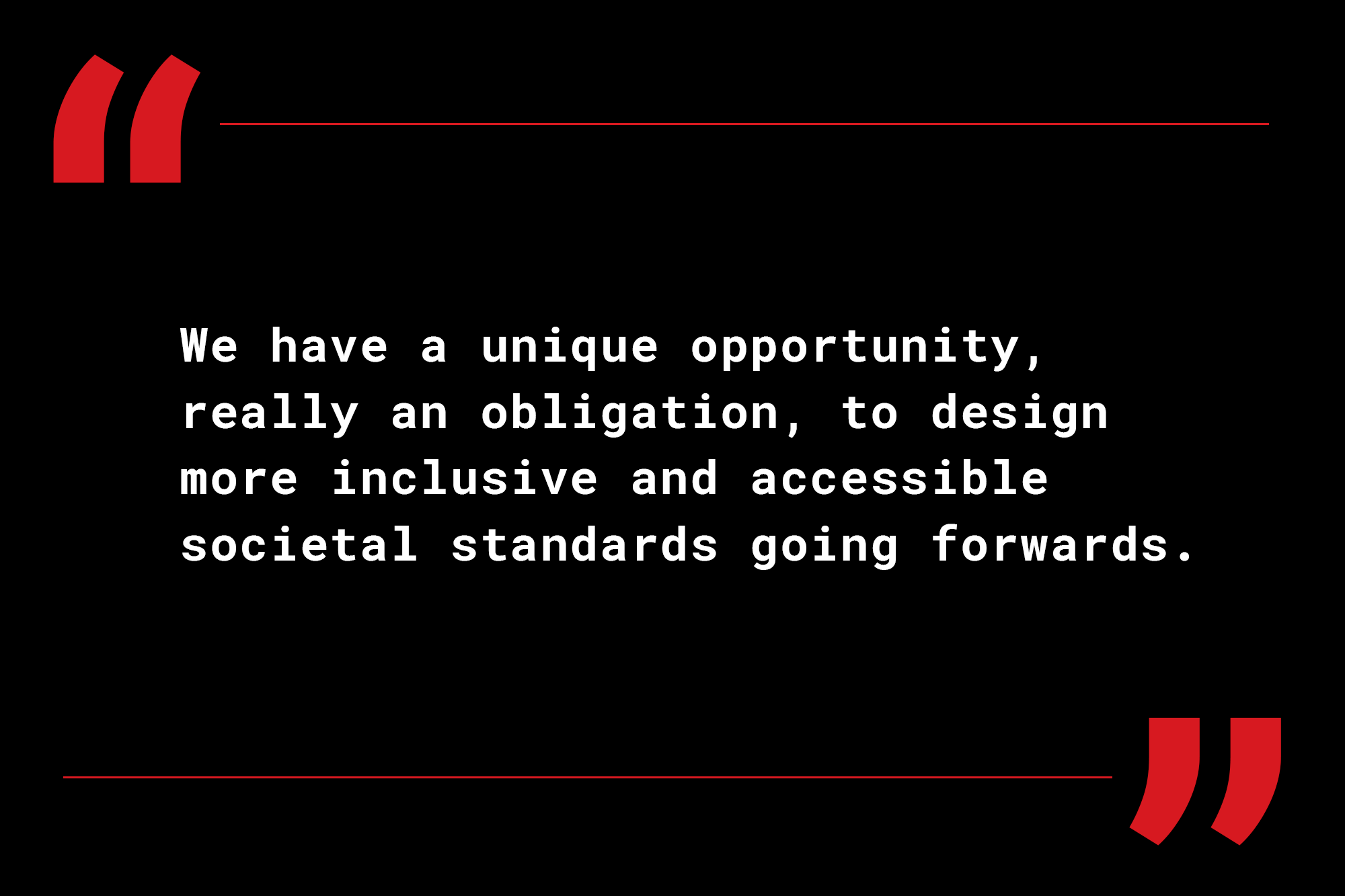
Inclusivity in general is a hard-hitting, “touchy” topic; lack of inclusivity and representation of underserved populations is a deeply systemic issue that can’t easily be resolved by just one person. But I feel through more strategic design and accessible solutions, we can work towards changing the fabric of society and help to “normalize” the experience of the “new normal” practices for everyday interactions as we emerge from the pandemic. We have a unique opportunity, really an obligation, to design more inclusive and accessible societal standards going forwards. With some critical thinking about how we can be more inclusive of others in our designs of communication visuals, aid objects, and protocols for daily activities, maybe we really can be “all in this together.”
What are some examples of accessible, inclusive design you’ve experienced during COVID-19? Leave a comment below to keep this important conversation going!
- accesibility
- accesible design
- COVID-19
- diversity
- inclusive design
- inclusivity
- representation
- social distancing signs
- visual aids


