The Signs of Social Distancing
As a designer, I’m constantly looking at the world a little differently, always taking mental note of the visuals I see in my environment. Working at Graffito and learning more about how our neighborhoods and cities are shaped, it’s become even more apparent to me how design has the power to affect our daily interactions in public spaces. Signage and other visual cues that shape certain public behaviors have been part of our societies for many years, whether we notice them or not. Some variations of signage that influence way we move about public spaces appear so subtle because we’ve been subconsciously obeying them for years, and they may not even rely on written messaging to get across their points. Cross walk lines painted on asphalt tell us that’s a safe area to cross a busy street. Red traffic lights mean “stop”, green means “go”, and yellow means “cautious” (or gun it, maybe). In retail environments, stanchions guide us into neatly formed checkout queues. Design helps to impart order and organization in our otherwise chaotic world.
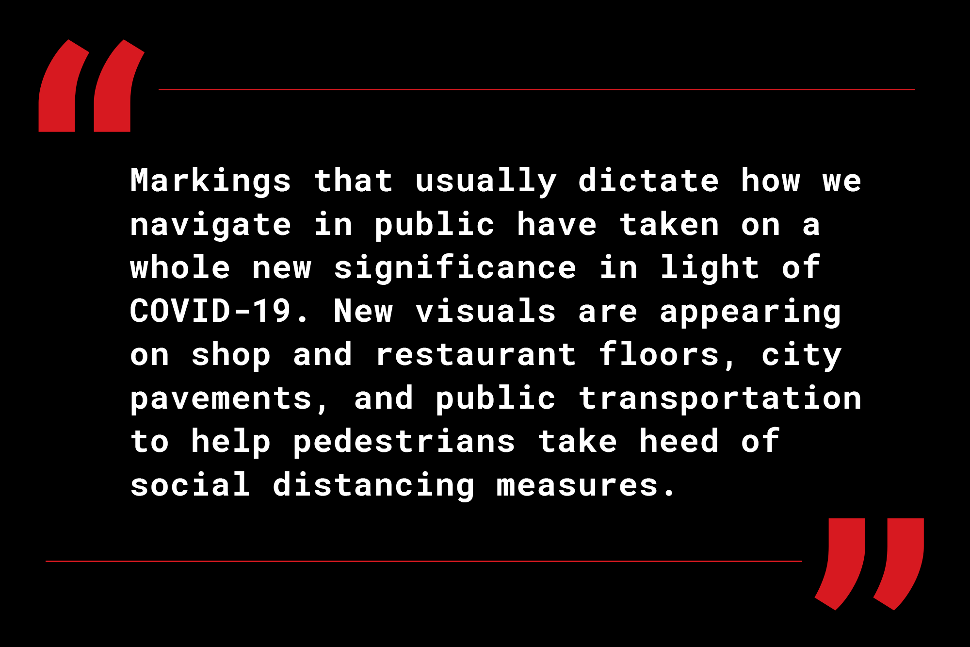
Markings that usually dictate how we navigate in public have taken on a whole new significance in light of COVID-19. New visuals are appearing on shop and restaurant floors, city pavements, and public transportation to help pedestrians take heed of social distancing measures. A recent article from Reuters that popped up on my newsfeed caught my attention as it featured some examples of social distancing signs from around the world. The signs, as shown below, demonstrate a wide range in the use of visual layout, color, messaging, and production method, and yet for all their differences they effectively send the same visual cue for people to maintain a clearly marked six-foot distance from one another.


While many social distancing graphics (particularly floor markers like these and also storefront window signs) have been put up in haste to comply with ever-developing public safety measures, I think businesses and public agencies will start to see the value of these types of graphics as they become more commonplace and integrated into our everyday public signage lexicon. These types of markers are definitely here to stay for a while as they become part of the “new normal.”
Social distancing markers like these, whether made of simple dots, lines, squares, or other familiar shapes, need to be impactful and clear but also strike a balance of being reassuring and friendly in their design. Making people feel cattle-driven is the last thing brands will want to do in times like these, so use of uplifting messaging, pleasant yet bold colors, and human-centric shapes like feet and heart silhouettes will go a long way to encourage positive reactions to the visuals.
The tone of these signs, both through visual means and actual language used on them, varies greatly in levels of politeness. “Stand here” noted within a red circle, while certainly a commanding and effective message, might be deemed too abrupt in a situation where people are already feeling a general sense of unease and anxiety. Brands might look to use more encouraging language, or even a bit of humor, to make people more receptive to these types of markers.
As these types of visuals become more long-term and retailers are gearing up to reopen businesses in the coming weeks, we may even start to see more standardization in COVID-19 signage design. A set of colors or iconography designated specifically for these types of markers, along with certain scale and placement strategy requirements, could help standardize them and make it easier for people to instantly recognize and comply with social distancing measures.
It will definitely be interesting to see how these types of COVID-19 signs and others continue to develop as our society moves into the next phases of life affected by the pandemic. More than ever, graphic design will hold such an important role in how information gets distributed to the public at all levels of daily interaction, and I’m sure we’ll be seeing how effective and visually engaging these pandemic-inspired designs can be.