A Personal Take on Grocery Shopping UX
Under normal circumstances, grocery shopping is my absolute favorite errand. I live right behind a Stop & Shop in East Somerville, so I’m a frequent shopper there and have come to enjoy and expect a regularly pleasant experience. My weekly grocery trips are oddly a source of relaxation; it’s “me” time that taps into my deep-rooted desire to be in control and make healthy conscious decisions, while putting me one step closer to my favorite hobby (cooking).
As of late, all those warm and fuzzy feelings have gone right out the window.
With rapidly changing store policies, delayed restocking of basic items, fear of catching or spreading germs, and a dwindling sense of control over anything in this life, I now absolutely dread grocery shopping. Since the start of my quarantine beginning March 14th, I’ve only made three total trips to the store, averaging about two weeks between. I normally much prefer making shorter, more frequent shopping excursions (sometimes as many as two or three times a week), especially since I’m within a short walking distance of the store and can only carry so many items at a time back to my apartment. Now, my boyfriend and I find ourselves driving literally two minutes to the store for meticulously planned, huge hauls to last us through weeks at a time.
The overall experience of grocery shopping in these times has been turned upside down, and I at least take solace in knowing I’m not the only one frustrated with the task lately. While I am incredibly thankful to the essential workers that are literally putting their health at risk to allow stores to remain in operation, a recent trip to our local Stop & Shop (on Friday April 17th, 8:30 AM) left me a little horrified at the (lack of) execution of store policies designed to help mitigate the risks of shopping during the time of COVID-19. Hours after I returned home, I found myself still seriously thinking about ways the grocery store user experience (UX) could be improved for both staff and shoppers in these times.
Below is a reflection of what I experienced at this particular store, and ways the UX could be improved. Please note that this is a commentary on my own personal experience and does not reflect policies/actions taken by other stores or essential employees at large. My UX suggestions may be idealist given a number of factors presently beyond control, but nonetheless improvements should be considered.
A) Parking lot signage is a must. The past two quarantine shopping trips have resulted in a strategically crafted plan for how to navigate the store; start on the far side entrance nearest the bread aisle and work our way through to produce sections, then back to the registers and out the door. Easy, right? Not so anymore; we parked in the farthest corner of the lot by our entry of choice, only to then walk to the entrance and notice a small printed paper sign taped to the door saying “This Entry Closed” (in probably about 16 point black font, no big lettering or eye-catching color). Had some clear, large signage been placed throughout the parking lot way before that closed off entrance, it would have saved us (and many others I’m sure) the headache of knowing where exactly to enter the store.
B) Create an actually welcoming (and clean) welcome experience. Finally, we get to the other entrance of the store, and notice the (again absurdly small) signs noting occupancy limits. A masked/gloved worker briefly glances up at us and exhaustedly taps a tablet, counting us as part of that occupancy. No hello, no words exchanged at all. A little courteous human interaction goes a long way these days. I clean a cart with a sanitizing wipe, then look for a hand sanitizer pump. No hand sanitizer in sight, though I distinctly recall using one at our favored, now closed entrance on our previous trip. Did it really not get moved to this entrance?! Stores should ensure that all entrance points have an available hand sanitizer station, and maybe even the employee counting occupancy could also offer disposable masks to those who enter without a face covering (which seems to be an alarmingly high percentage of shoppers). I recognize that’s just an ideal scenario; I know supplies are in high demand and not always available, but if stores focused on creating a safe, welcoming, and clean entry experience, it would really improve the overall experience from the start. By this point I’d only just entered the store and was feeling a little less humanized, a little less safe and sanitized, and just wanting to get this over with already.
C) For the love of God, please clearly and accurately mark the flow of traffic for “one-way” aisles. One of the most frustrating aspects of our trip came from the super confusing taped directional arrows on the floor. I wish I had taken photos of the madness but was too bewildered in the moment. A faint arrow (grey tape on a grey floor, nice) started at one of the produce aisles, directing shoppers in a one-way fashion. Great, totally logical. Until I reached the end cap and there was no “turn” arrow, so I wasn’t entirely sure which way to go next. The next aisle strangely had the same direction as the one I just came through…was I supposed to double back to the other end?! Things got even more confusing as the arrows stopped entirely by the deli sections for some unknown reason, leaving them a free-for-all. We picked back up on the chaotic maze of arrows a few sections over, but noticed no one really enforcing them and many people were doubling back down aisles against the “flow.” Halfway through the store, my boyfriend and I literally stopped in our tracks and laughed as we realized the past three aisles we’d been down had arrows at both ends pointing towards the middle, absolutely defeating the “one way” idea. I find it hard to believe this policy has been in place in Stop & Shop stores since April 7th, and it is still, weeks later, implemented so poorly that shoppers and staff alike seemed to have absolute disregard for it. It really needs to be fixed; clear markers placed more frequently, turn arrows at the end caps, and an accurate directional flow that’s truly one-way would improve the execution of this idea.
D) Kindly inform shoppers if entire sections of an aisle are out of stock. As we made our way through the store, I felt my blood pressure rising each time I turned down an aisle only to discover the item I needed wasn’t there at all. I know this is a super common experience in these times when supply chains are taking huge hits, staff is scrambling to restock items and their substitutes, and people are just irrationally hoarding products, but nonetheless I still felt irritated. Whole sections of aisles were entirely wiped out; I’m talking absolutely no flour of any kind in the baking aisle, no quarts of any yogurt in the dairy section, no toilet paper (expected though at this point). It’d be helpful if the store posted signage at the start of those aisles alerting shoppers that those items/sections of an aisle were currently out of stock, and maybe even note a potential restocking date. Had I known I wouldn’t be able to find anything I needed in the baking aisle, I would’ve avoided it completely and wouldn’t have nearly been ran over by a 90 year old woman (without a face mask, mind you) barreling down the aisle the opposite way. Simple, clear “out of stock” signage could make shoppers’ experiences more effective and streamlined while helping people avoid unnecessary proximity with other shoppers.
E) Recognize that in times of a public health crisis, if safety measures are not seen being enacted in real time, it’s not good enough for customers. Appearance is everything. Look, I’d personally love to be less paranoid and just assume that the checkout pad (covered in suspiciously worn-looking plastic wrap) has just been sanitized literally seconds before I arrived. I’d love to be able to convince myself that the staff member manhandling re-organizing bags of chips without wearing gloves had just washed his hands minutes before and simply forgot to don a new pair of gloves. I’m not normally a paranoid person, and under normal circumstances I have no problem giving people the benefit of the doubt; we’re all human, after all. But these are not normal times. In a moment like this when public health and safety is so absolutely critical, we all deserve a guaranteed safe and sanitized shopping experience from start to finish, and I need to see it happening in real time for my own peace of mind. If they haven’t been instructed already, staff should make it a priority to verbally engage with the customer at checkout and make it announced and seen that they’re wiping down the checkout pad and belt dividers just for that customer. Each and every time, no exceptions. Make it a personal experience, make it obvious that you’re taking precautions to protect our health and committing to the store policies that are supposed to be doing just that. Now more than ever is the time for stores and their employees to be extra vigilant that their actions (or inactions) are being scrutinized, and act accordingly to make it overly apparent that they’re adhering to these policies and taking precautions seriously.
F) Finally, it’s in the bag. Overall, my shopping experience at Stop & Shop this time around was miserable and disheartening, but there was one actual UX improvement I saw the store make in the time since our previous trip. In light of the ban on shoppers’ using their own reusable bags, the store was previously offering only smaller paper bags without handles, leading to a few somewhat overloaded bags ripping by the time we got them from the cart to our car. This time, we were given paper bags with sturdy handles. Major, major UX improvement on their part. It’s a small but significant change that made bagging and unloading so much easier, and that sums up the impact of UX; sometimes all it takes is one small adjustment for someone’s experience to be improved.
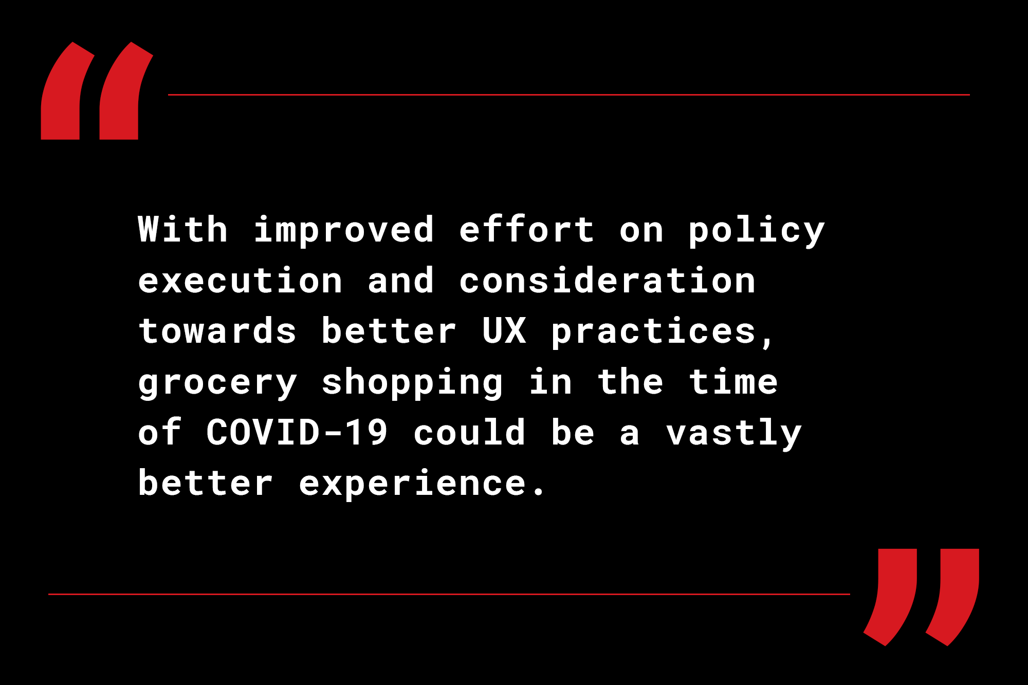
I’m hoping in the days since this shopping excursion, this store in particular is working to resolve some of these glaring UX issues. I’m in no way personally blaming the workers of this establishment for the frustrations I experienced, but there just has to be some solutions, no matter how small, that can help make the grocery shopping experience a little safer, efficient, and less frustrating for workers and shoppers alike. Good design and UX are actually rarely noticed since they create seamless, pleasant experiences that feel natural and uninterrupted. When there are UX issues, the opposite occurs, and these irritations become so glaringly apparent. With improved effort on policy execution and consideration towards better UX practices, grocery shopping in the time of COVID-19 could be a vastly better experience.