Logos These Days
Big and small brands all over the world are doing what they can to make a splash in the press. Ok, you could argue, if you were less cynical than me, that these companies are just doing their best to help during the coronavirus outbreak by sending a positive message, or by making us laugh, both of which are equally important right now. Either way, the lesson here is that it doesn’t take much to use popular imagery and messaging to help promote safety and harmony.
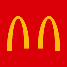
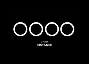
Early on in the crisis, MacDonalds (Brazil) changed up its own logo as we came to grips with social distancing, and a few brands followed, like Audi and VW:

Companies like Burger King (UK) have changed things up as well. When they closed their stores, they posted a simple, yet clever photoshopped pic with a caption that read, “We’ll be back, but for now…”
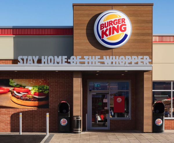
“Stay Home of the Whopper” eventually actually became an entire ad campaign in the US. Have you seen it?
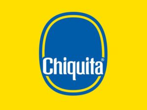
Even Chiquita bananas has used this opportunity to change things up. They posted an image on Instagram (where else?) of its iconic yellow and blue sticker with its mascot, Mis Chiquita, removed. The caption read, “I’m already home. Please do the same and protect yourself. #stayhome.” I was hoping that this simple change was a cheap and easy effort, maybe thought of by someone in the mailroom looking to make a splash with the executives. But I found out that the “campaign” was developed by the Chiquita digital team and their parter YoungNetwork Group, a Portuguese digital agency. Still, seems like a simple way to get some press…Uh, I mean, a great way to spread an important message…
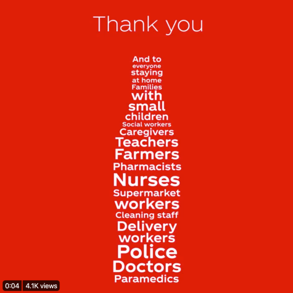
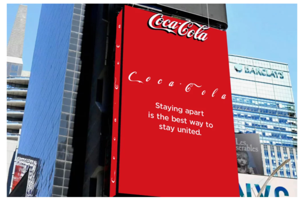
And you know that Coca Cola was going to do something interesting. The company used their bottle shape to thank all of the essential professionals and people that have been staying home to stop the spread of the virus. They also ran a billboard ad in Times Square that featured its iconic logo with extended spaces between letters. The ad is accompanied by the message, “Staying apart is the best way to stay connected.”
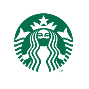
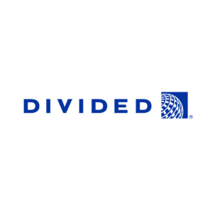
Finally, Slovenia-based designer Jure Tovrljan gave other well-known logos face lifts to better suit current events. They are brilliant, funny, and at times a bit sad (I still feel bad for Corona Beer). Tovrljan says he, “…decided to revive an old passion, logo design and I saw an opportunity for some quality content that I would be glad to see on my social feed in these difficult times.” He started with the Starbucks logo and continued on from there to develop some pretty smart alternatives. Enough talk, see for yourself!


- Audi
- Branding
- Burger King
- Chiquita
- Coca Cola
- COVID-19
- Drew Katz
- Graphic Design
- humor
- Jure Tovrljan
- Logos
- MacDonalds
